Examples – Demos - http://bxslider.com/examples
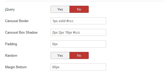
- jQuery = jQuery Enable / Disable
- Carousel Border = Border for Carousel e.g. none or 1px solid #eee
- Carousel Box Shadow = Box Shadow for Carousel e.g. 2px 2px 10px #ccc
- Padding = Carousel or Mask or Text Padding. It depends if mask enabled and text position. e.g. 2px 2px 10px or 10px or 20px 0px
- Random = Shuffle carousels for random ordering
- Margin Bottom = Margin Bottom for carousel e.g. 60px, 0px, 10%
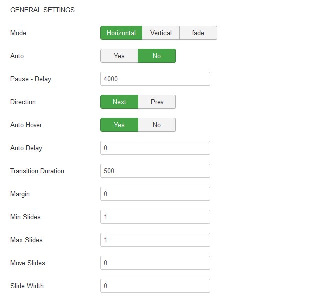
GENERAL SETTINGS
- Mode = Type of transition between slides, horizontal, vertical or fade
- Auto = Auto Start. Slides will automatically transition.
- Pause - Delay = The amount of time (in ms) between each auto transition
- Direction = The direction of auto show slide transitions.
- Auto Hover = Auto show will pause when mouse hovers over slider.
- Auto Delay = Time (in ms) auto show should wait before starting. e.g 0
- Transition Duration = Slide transition duration (in ms) e.g. 500
- Margin = Slide Margin e.g. 0 or 10 or 35
- Min Slides = The minimum number of slides to be shown. Slides will be sized down if carousel becomes smaller than the original size.
- Max Slides = The maximum number of slides to be shown. Slides will be sized up if carousel becomes larger than the original size.
- Move Slides = The number of slides to move on transition. This value must be bigger or equal minSlides, and smaller or equal maxSlides. If zero (default), the number of fully-visible slides will be used.
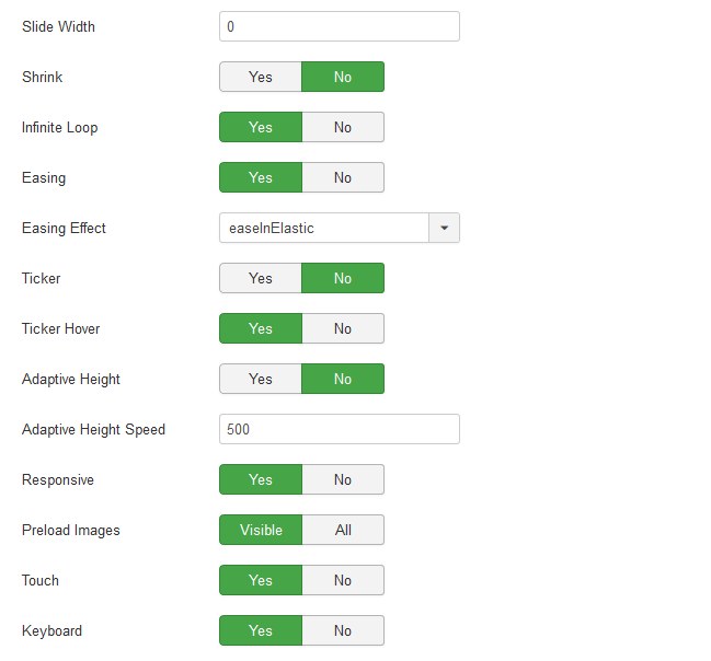
- Slide Width = The width of each slide. This setting is required for all horizontal carousels! e.g. 0 or 300 or 5000
- Shrink = Shrink Slider to fit dimensions
- Infinite Loop = If Yes, clicking Next while on the last slide will transition to the first slide and vice-versa
- Easing = jQuery Easing transition effects Enable / Disable
- Easing Effect = The type of easing to use during transitions. swing or linear
- Ticker = Use slider in ticker mode (similar to a news ticker).
- Ticker Hover = Ticker will pause when mouse hovers over slider. Note: this functionality does NOT work if using CSS transitions!
- Adaptive Height Speed = Slide height transition duration (in ms). Note: only used if adaptiveHeight: true, Integer e.g. 500 *only for Images not backgrounds
- Responsive = Enable or disable auto resize of the slider. Useful if you need to use fixed width sliders.
- Preload Images" = If 'all', preloads all images before starting the slider. If 'visible', preloads only images in the initially visible slides before starting the slider (tip: use 'visible' if all slides are identical dimensions). Works only on images
- Touch = Enable or disable Touch. If Yes, slider will allow touch swipe transitions.
- Keyboard = Enable or disable Keyboard. If Yes, keyboard can be used for carousel navigation.
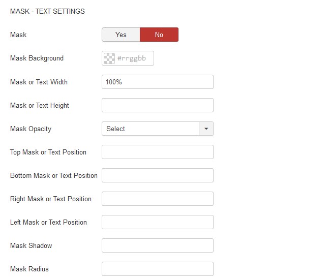
MASK - TEXT SETTINGS
- Mask = Enable Mask yes or no
- Mask Background = Mask background color selection
- Mask or Text Width = Mask or Text width px or %
- Mask or Text Height = Mask or Text height px or %
- Mask Opacity = Select Mask opacity from 0.0 to 1.0
- Top Mask or Text Position = Mask or Text position from the top px or % e.g. 10px *This affects the positioning of the contents within the slide
- Bottom Mask or Text Position = Mask or Text position from the bottom px or % e.g. 10px *This affects the positioning of the contents within the slide
- Right Mask or Text Position = Mask or Text position from the right side px or % e.g. 10px *This affects the positioning of the contents within the slide
- Left Mask or Text Position = Mask or Text position from the left side px or % e.g. 10px *This affects the positioning of the contents within the slide
- Mask Shadow = Shadow for Mask e.g. #ccc 2px 3px 5px
- Mask Radius = Radius for Mask px or % e.g. 10px or 20%
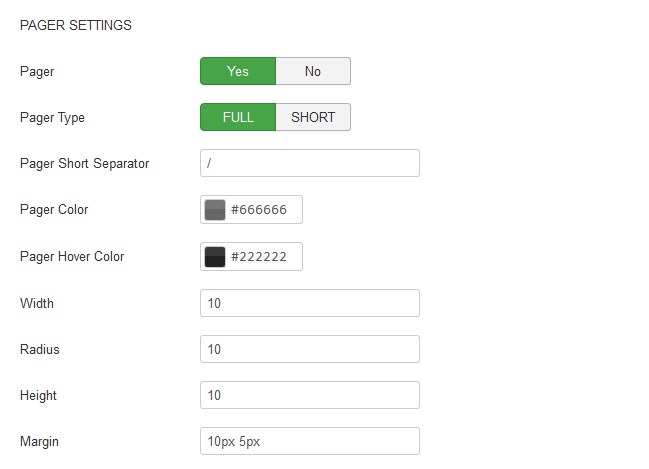
PAGER SETTINGS
- Pager = Enable / Disable Pager. If Yes, Next / Prev controls will be added
- Pager Type = If 'full', a pager link will be generated for each slide. If 'short', a x / y pager will be used (ex. 1 / 5)
- Pager Short Separator = description="If pager Type: 'short', pager will use this value as the separating character. E.g “/”
- Pager Color = Pager bullets color selection
- Pager Hover Color = Pager hover bullets color selection
- Width = Width of pager bullets e.g. 10 (without px). Note: if you want bullets to be circle width, height and border radius must be equal
- Radius = Radius of pager bullets e.g. 10 (without px). Note: if you want bullets to be circle width, height and border radius must be equal
- Height = Height of pager bullets e.g. 10 (without px). Note: if you want bullets to be circle width, height and border radius must be equal
- Margin = Margin of pager bullets e.g. 0 5px or 10px.
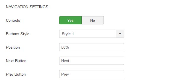
NAVIGATION SETTINGS
- Controls = Enable / Disable Controls. If Yes, Next / Prev controls will be added
- Buttons Style = Select Buttons style.
- Position = Navigation buttons position from top px 0r %. e.g. 50% or 200px
- Next Button = Text to be used for the Next button control
- Prev Button = Text to be used for the Prev button control